Cluster overview redesign
Redefining CockroachDB Cloud’s highest-traffic surface around operational health
The Cluster Overview page is the most visited surface in the CockroachDB Cloud console, but nobody had clearly defined its purpose. Over time, teams added information whenever it seemed useful locally, turning the page into a fragmented experience.
When two new projects needed placement on the page, I recognized the underlying issue wasn’t layout, it was information architecture. I led a cross-functional redesign to redefine the page around operational insights and create a scalable framework for future additions.
Role - Sr. Staff Product Designer leading UX strategy, research, and cross-functional alignment
Team - Cross-functional initiative spanning 5 PMs, Engineering, Design, Data, and UX research
Strategic contribution - Created the information architecture and decision-making framework now used to evaluate future additions to the Cluster overview
Timeline - Q3-4 2025
Platform - CockroachDB Cloud
Status - Development in progress
Challenge
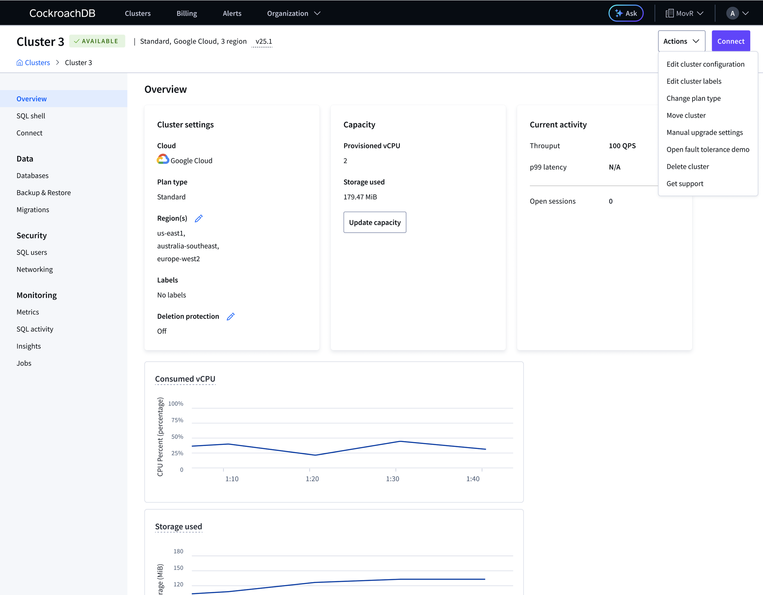
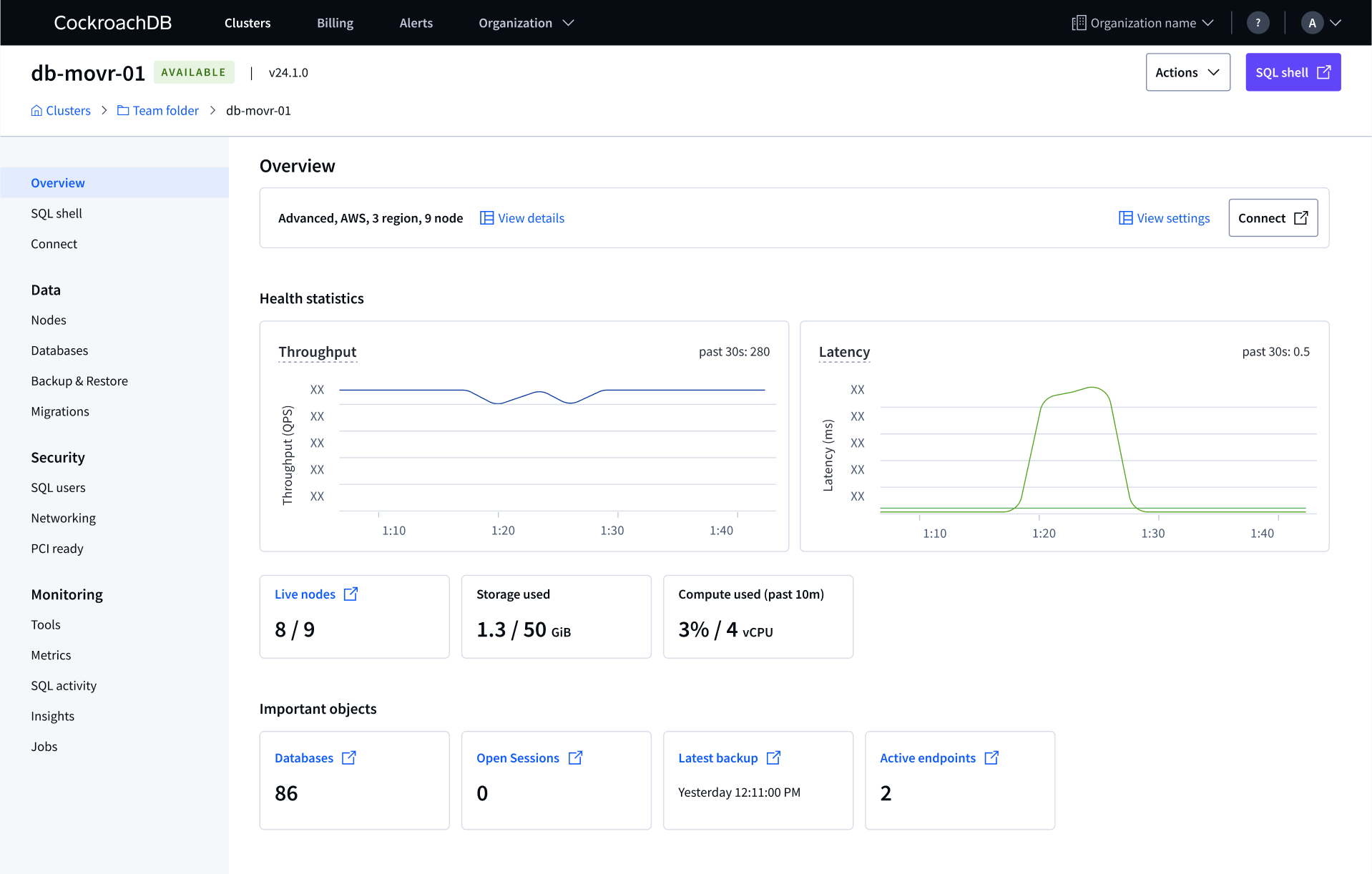
The Cluster overview page had grown organically since 2021 with no defined purpose. Advanced clusters showed only static configuration and settings on their most visited page, no health data. Basic and Standard clusters had evolved further but the hierarchy was wrong, too much visual weight on configuration and settings.
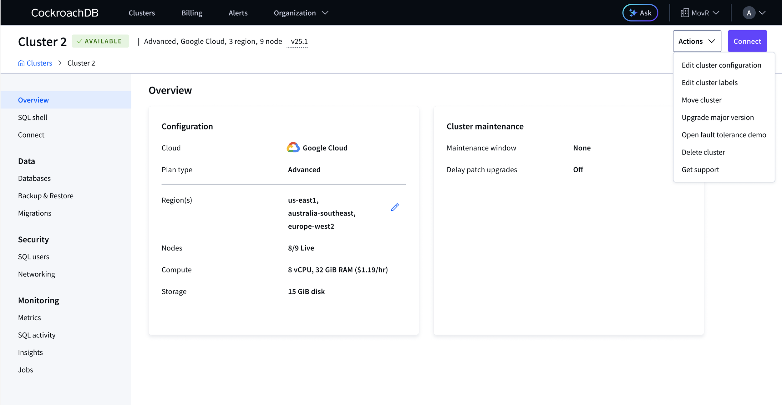
The Actions menu had grown equally unwieldy, mixing topology changes, settings, and cluster actions with no organizing logic.
In 2025, two new features were heading for this page, a resilience demo and PCR. As lead designer for PCR, I recognized that we couldn’t keep adding to a broken foundation. I got buy-in from the Design team. While finding space for two more features, we’d define what this page was actually for and build a decision-making model for everything that came after.
Advanced cluster overview (before), most visited surface showing only static configuration and settings data
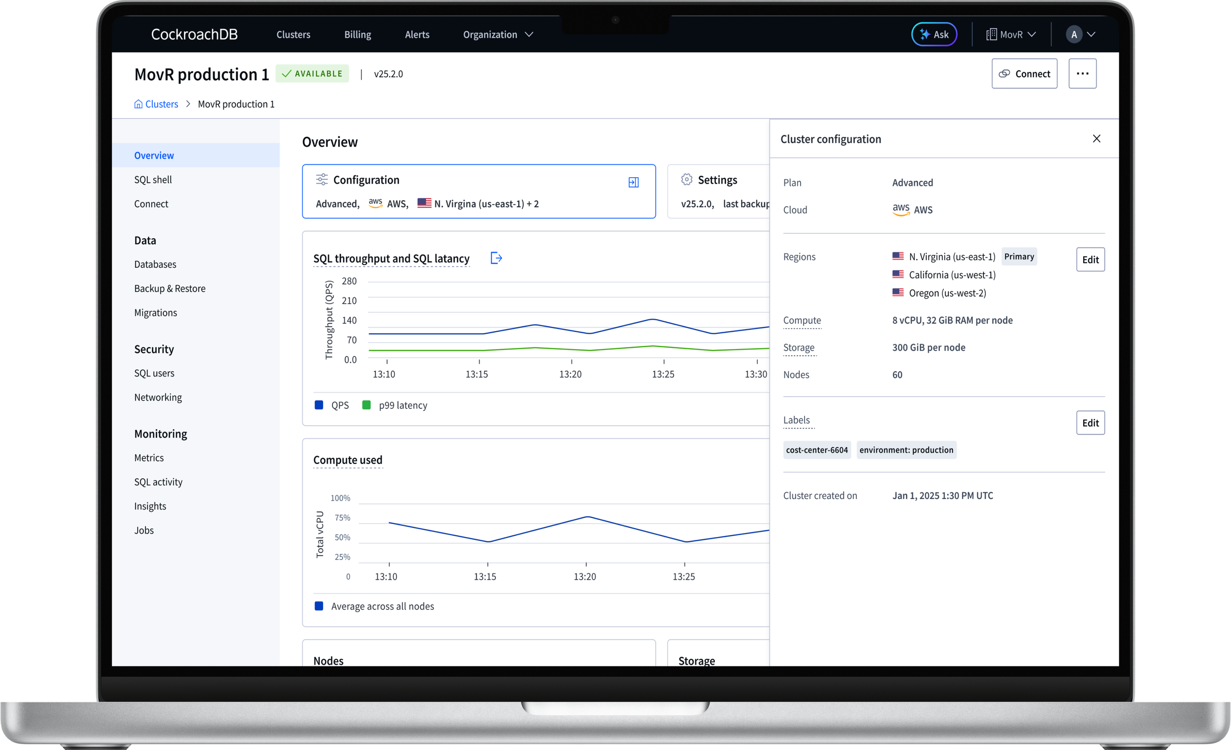
Standard cluster overview (before), health data present but under-weighted
Reframing the problem
The original ask was straightforward, find the right place to add new PCR data to the existing Cluster overview page. But that framing assumes that the current page structure is sound. We’d never actually interrogated whether what was already there belonged at the overview level at all.
I recognized that our layout problem was actually an information architecture problem and we needed a principled framework first. I ran an object-oriented UX (OOUX) exercise to map the full object hierarchy across the console. The work was hard in a domain this complex, and revealing. We found significant navigation dead ends and child objects that were effectively invisible from the overview. This exercise helped us form an opinion on what belongs here before deciding where it goes.
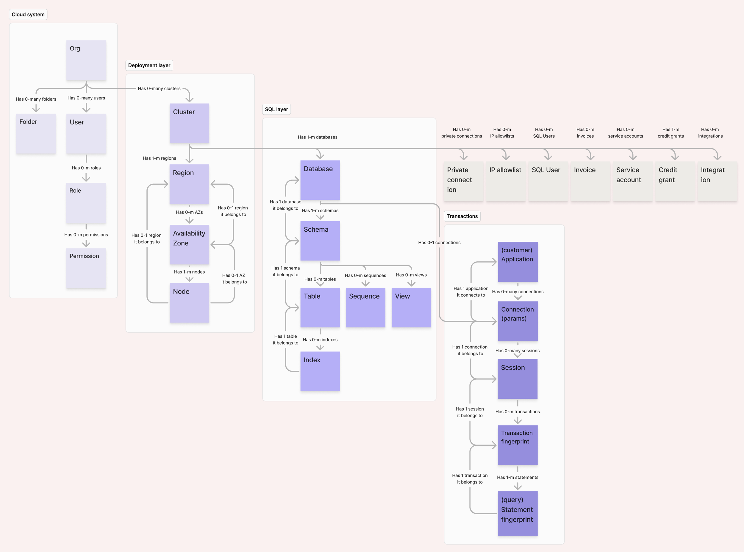
Object relationship map for the Cluster object: the tangle of connections from Cluster outward is what justified a framework-first approach before any layout work
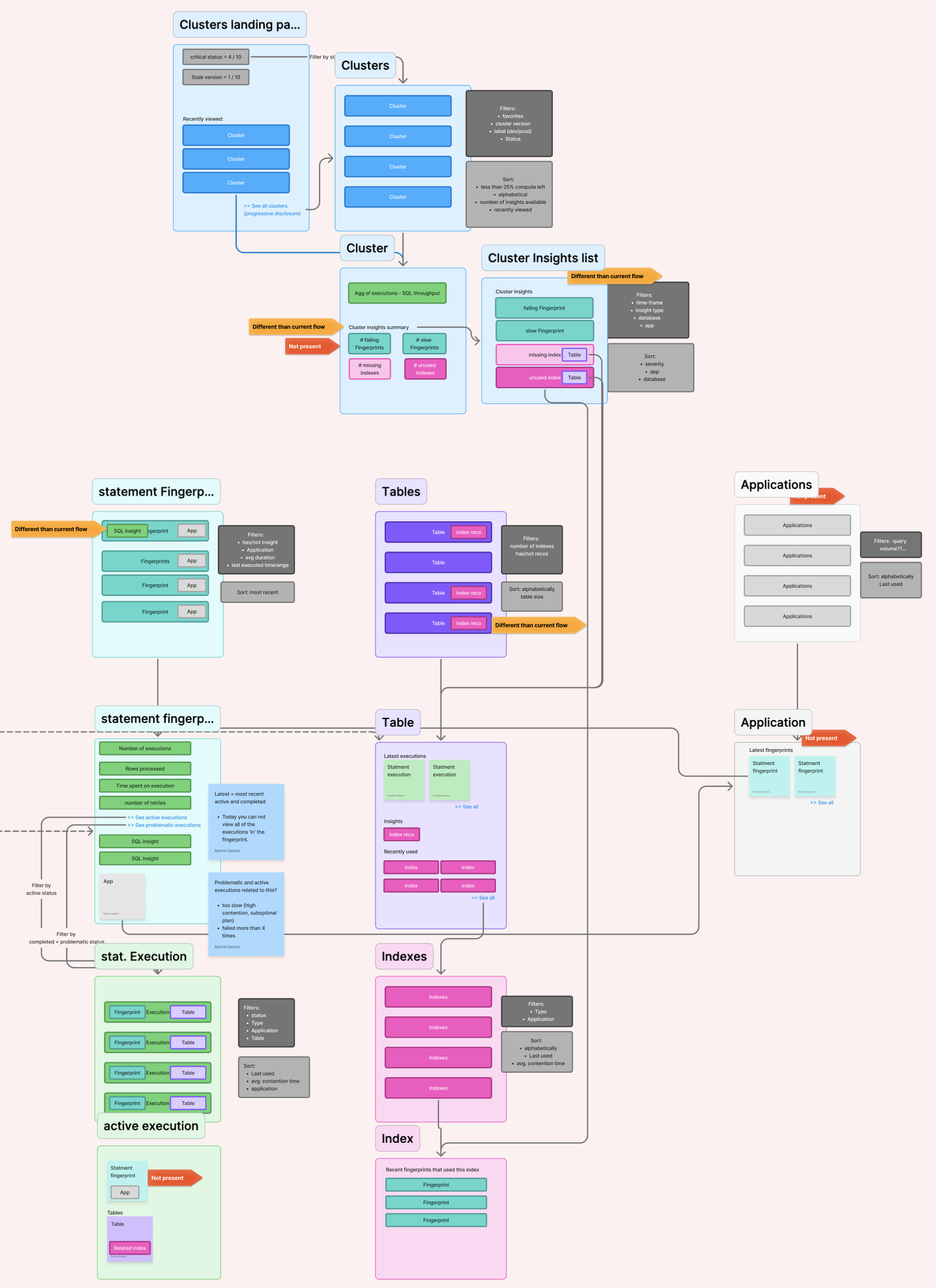
Nav flow diagram: Drilling into the cluster hierarchy mapping navigation paths and identifying dead ends
Learning from research
I partnered with a UX researcher to analyze usage data and conduct user interviews. Usage data showed the Cluster overview page had significant traffic, but that was misleading. Clicking into any sub-page (databases, networking, backups) required passing through the overview first. High page views didn't mean anyone was actually looking at it. While high page views for sub-pages, Databases and SQL shell, did represent interest in that content.
Our hypothesis going into round 1 of user interviews was that the page should serve two jobs: give operators a glimpse of what's inside the cluster (databases, SQL activity), and surface health at a glance. We tested structural information (configuration, settings), workload health data (throughput, latency, compute), and nested objects (databases, open connections, last backup, active private endpoints).
Users were clear: The workload health data was what mattered. The nested objects were nice to have, useful in calm moments and irrelevant in urgent ones.
With this learning, we reframed the page’s purpose to focus on workload health for round 2. What operators needed from this page was just enough signal to understand what’s happening on the managed side and whether it requires action on theirs. We learned that for managed infrastructure, there were some health indicators that needed to come from our system rather than the customer’s own observability tooling (Datadog, Prometheus).
Round 1 prototype: Health metrics and priority child objects
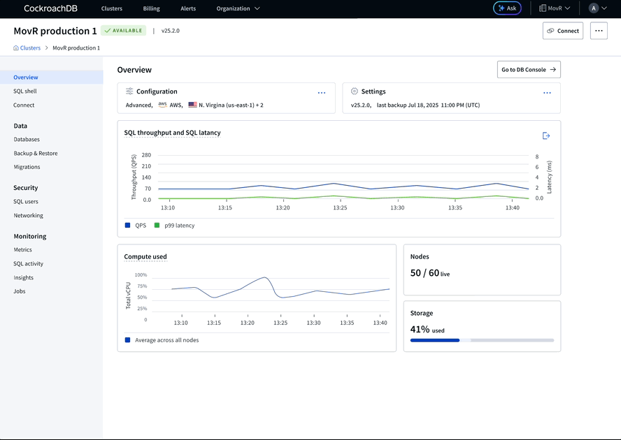
Round 2 prototype: Focus on health metrics, refining visual weight
Calibrating visual weight
Based on the research, I got buy-in on the page's purpose. Now I needed to decide how much space each metric deserved. This required balancing research findings, design judgment, and the needs of two parallel projects.
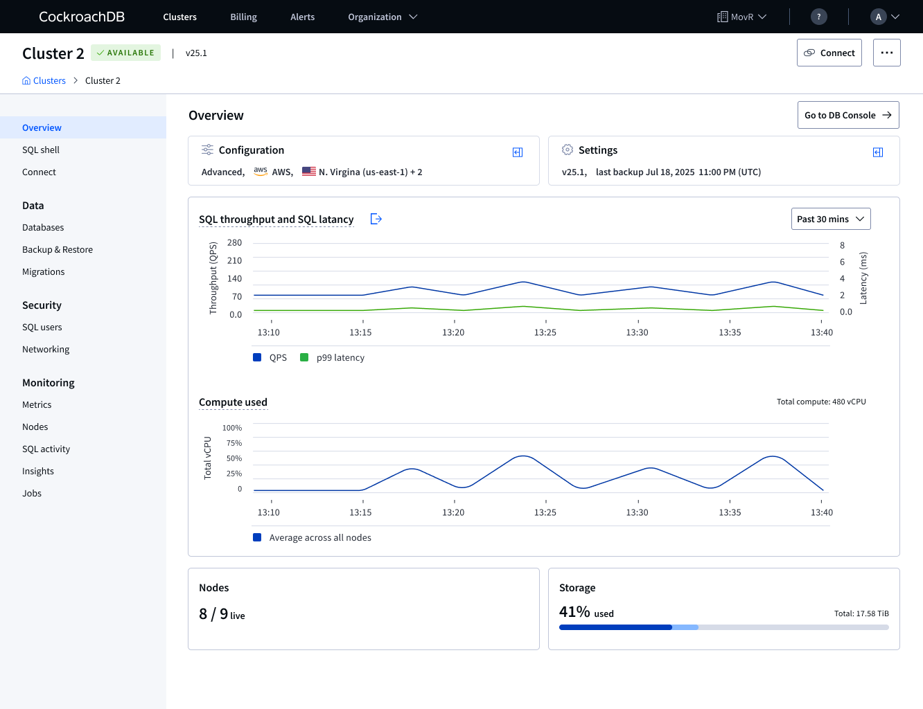
Throughput and latency were unambiguous. Interview after interview users described these as the visual embodiment of their workload. We collapsed these into a single chart to make it easier to understand correlation, and gave it the largest footprint. It helped that a parallel project, a resilience demo, also needed throughput and latency on this page. This validated the priority and made alignment easy.
Compute surprised us. I originally gave it a small footprint, treating it as secondary to throughput. But as interviews accumulated it became clear users weighted it almost as heavily so it moved up. Research, not assumption, made that call.
Configurations and settings were the hardest debate, mostly between all of the designers. Research showed users rarely touched it, more of a set it and forget it. I considered moving it to the bottom of the page. But it describes what the cluster is, its fundamental building blocks. We kept it small, at the top, as a "what am I looking at" anchor. Once configuration and settings had a home on the page, editing them inline became intuitive which also resolved our Action menu issues.
Storage was straightforward: genuinely set it and forget it for most users. It earned a medium footprint with clear affordance for warning states, the number matters most when it's almost gone.
Nodes were the most delicate needle to thread. Users were curious about them but they chose a managed service specifically to not have to manage nodes. Showing too much detail would create anxiety about something Users can't act on. We gave nodes a medium footprint, enough to satisfy the curiosity not enough to suggest responsibility. As with Storage, having a nodes section provided clear affordance for warning states.
Outcomes
This project hasn't shipped yet but its impact on the product organization is already tangible. For the first time, Product and Design have a shared short and long-term plan for the Cluster overview page. I got stakeholders to align on the health-first framework as well as what to consider next. Additional health metrics (disaster recovery, security), recommended actions, and new feature callouts are now a prioritized roadmap.
The project also produced a durable decision-making framework for future additions. When the next feature arrives, the team can ask: is this configuration? A setting? A health metric? The answer tells you where it belongs, saving design and engineering time and building predictability for users who learn the page's logic over time.
Most importantly, the most visited page in the console will finally be useful. Every user interview told the same story: operators navigate to the Cluster overview to get somewhere else. The redesign gives them a reason to stop.
On the measurement side, I worked with the data team to instrument time-on-page data which wasn’t being tracked. When the page ships, we'll have a clean before/after signal to evaluate whether the new layout is actually changing user behavior.
What I’d do differently
I'd have brought the broader PM group in earlier, and more than once.
I made a deliberate choice to wait until I had data and concrete options before involving all stakeholders. We had never formally discussed this page before, and I knew that opening the conversation too early risked turning alignment sessions into competing wish lists. I wanted to herd the work, not the people.
That instinct wasn't wrong, but the timing was probably too conservative. The Cloud PM was involved at every step, but the other PMs rightly felt genuine ownership over this page too. Earlier exposure to the analysis and learnings would have made the final alignment smoother and the long-term buy-in stronger.
Next time I'd treat stakeholder exposure as a drip, not a reveal.